Choveu Cliente, 2024
choveu: website redesign
choveu:
website redesign
choveu: website redesign
view website
view website
view website

my role
my role
my role
I led the redesign process, from scoping and user flows to wireframes, prototypes, and usability testing, while creatively integrating the new visual identity to ensure consistency and enhance the user experience.
I led the redesign process, from scoping and user flows to wireframes, prototypes, and usability testing, while creatively integrating the new visual identity to ensure consistency and enhance the user experience.
I led the redesign process, from scoping and user flows to wireframes, prototypes, and usability testing, while creatively integrating the new visual identity to ensure consistency and enhance the user experience.
project scope
project scope
project scope
A squad of designers and one developer - 3 weeks (remote).
A squad of designers and one developer - 3 weeks (remote).
A squad of designers and one developer - 3 weeks (remote).
tools
tools
tools
Figma, Photoshop, Illustrator, Miro, ClickUp.
Figma, Photoshop, Illustrator, Miro, ClickUp.
Figma, Photoshop, Illustrator, Miro, ClickUp.

project overview
project overview
project overview
The project involved redesigning the website for a Spanish-Brazilian marketing company specializing in the pharmaceutical sector. The goal was to modernize the site using the brand’s new colors, streamline the user experience, and better align it with client needs. This redesign aimed to enhance usability, reflect the company’s bilingual and multicultural approach, and showcase a wide variety of past projects.
Business objectives for the redesign:
• Simplifying navigation to enhance usability;
• Supporting the promotion of new campaigns and marketing initiatives;
• Creating a cohesive digital presence that reflects the company’s expertise in both Spanish and Brazilian markets;
• Delivering a modern, professional, and visually appealing interface to position the company as a leader in the sector.
challenges
challenges
challenges
• The existing website had a complex navigation structure, making it difficult for users to access key information efficiently.
• The website lacked a modern, professional look, making it less competitive and engaging for industry leaders.
• Key campaigns and marketing initiatives were not prominently featured, reducing their visibility and impact.
solutions
solutions
• Simplified the navigation by organizing content into clear, intuitive categories.
• Implemented a clean, responsive design with a professional aesthetic to position the company as a leader in the pharmaceutical marketing sector.
• Designed dynamic sections to highlight ongoing campaigns and updates, increasing engagement and visibility for critical initiatives.

wireframing & prototyping
wireframing & prototyping
wireframing & prototyping
To align with the brand's new colorful and modern identity, I created four distinct wireframe proposals. Each design was crafted to explore unique visual and functional approaches. During the presentation, I detailed the rationale behind all design decisions to ensure alignment with project goals.
From these proposals, two concepts were selected for further development, and I created high-fidelity prototypes to bring them to life. After validating and testing, we finalized the design by combining the strongest elements from each proposal, achieving a cohesive and user-friendly solution.

selected improvements
selected improvements
selected improvements
Here are key design enhancements that formed the foundation for the comprehensive system redesign. These improvements were strategically implemented to address user pain points, streamline navigation, and create a more engaging and visually appealing experience. Each approach aimed to align the system's functionality with user needs while reinforcing the brand's identity and reliability.
Here are key design enhancements that formed the foundation for the comprehensive system redesign. These improvements were strategically implemented to address user pain points, streamline navigation, and create a more engaging and visually appealing experience. Each approach aimed to align the system's functionality with user needs while reinforcing the brand's identity and reliability.
Here are key design enhancements that formed the foundation for the comprehensive system redesign. These improvements were strategically implemented to address user pain points, streamline navigation, and create a more engaging and visually appealing experience. Each approach aimed to align the system's functionality with user needs while reinforcing the brand's identity and reliability.

before
before
before
The site had inconsistent spacing and content layout, making navigation difficult for users. There were few engaging visuals, and the contact button was hidden, leading to low interaction rates. Some service descriptions lacked detail or follow-up, leaving users unclear about offerings.
The site had inconsistent spacing and content layout, making navigation difficult for users. There were few engaging visuals, and the contact button was hidden, leading to low interaction rates. Some service descriptions lacked detail or follow-up, leaving users unclear about offerings.
The site had inconsistent spacing and content layout, making navigation difficult for users. There were few engaging visuals, and the contact button was hidden, leading to low interaction rates. Some service descriptions lacked detail or follow-up, leaving users unclear about offerings.
after
after
after
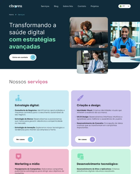
The redesign introduced the brand’s new colors and visuals to enhance engagement and credibility. Improved spacing, added breadcrumbs for easier navigation, and repositioned the contact button for better visibility. Bullet points were added to clearly outline services, reducing inquiries for services outside the agency's scope.
The redesign introduced the brand’s new colors and visuals to enhance engagement and credibility. Improved spacing, added breadcrumbs for easier navigation, and repositioned the contact button for better visibility. Bullet points were added to clearly outline services, reducing inquiries for services outside the agency's scope.
The redesign introduced the brand’s new colors and visuals to enhance engagement and credibility. Improved spacing, added breadcrumbs for easier navigation, and repositioned the contact button for better visibility. Bullet points were added to clearly outline services, reducing inquiries for services outside the agency's scope.

before
before
before
This section was unclear and lacked engaging previews or images of the projects, making it difficult for users to identify and click through to view complete versions.
This section was unclear and lacked engaging previews or images of the projects, making it difficult for users to identify and click through to view complete versions.
This section was unclear and lacked engaging previews or images of the projects, making it difficult for users to identify and click through to view complete versions.

after
after
after
The redesign introduced visually appealing previews of projects in areas such as websites, branding, and marketing. Each preview included an engaging image and a brief description to capture user interest.
The redesign introduced visually appealing previews of projects in areas such as websites, branding, and marketing. Each preview included an engaging image and a brief description to capture user interest.
The redesign introduced visually appealing previews of projects in areas such as websites, branding, and marketing. Each preview included an engaging image and a brief description to capture user interest.
summary
summary
summary
The website redesign successfully transformed the user experience by addressing critical pain points and aligning the interface with the company’s vibrant new visual identity. Through thoughtful user-centered design, improved navigation, and engaging visuals, the updated platform now effectively showcases the company’s expertise and services while catering to a diverse, trilingual audience. This project not only enhanced usability but also reinforced the company’s commitment to innovation and professionalism in the pharmaceutical marketing sector.
The website redesign successfully transformed the user experience by addressing critical pain points and aligning the interface with the company’s vibrant new visual identity. Through thoughtful user-centered design, improved navigation, and engaging visuals, the updated platform now effectively showcases the company’s expertise and services while catering to a diverse, trilingual audience. This project not only enhanced usability but also reinforced the company’s commitment to innovation and professionalism in the pharmaceutical marketing sector.
The website redesign successfully transformed the user experience by addressing critical pain points and aligning the interface with the company’s vibrant new visual identity. Through thoughtful user-centered design, improved navigation, and engaging visuals, the updated platform now effectively showcases the company’s expertise and services while catering to a diverse, trilingual audience. This project not only enhanced usability but also reinforced the company’s commitment to innovation and professionalism in the pharmaceutical marketing sector.
20%
20%
20%
increase in total time on site
increase in total time on site
increase in total time on site
27%
27%
27%
more leads generated
more leads generated
more leads generated
34%
34%
34%
rise in task completion rates
rise in task completion rates
rise in task completion rates
16%
16%
16%
drop in bounce rate
drop in bounce rate
drop in bounce rate